Group Pisang–PROJECT

Screen Shot 2018-01-19 at 8.45.10 PM

PreImpressions

Through our prep research in Sydney we could see some of the problems. We could see how a developing country could struggle to make a dent in a socially instituted problem. We could see how the industry within thenation caused issues and that our job would not be easy. But it was all theoretical. We didn’t really know anything about the city. We didn’t know how the food tasted, or that we’d be celebrities, or that we’d become mates with people from an utterly different cultural context. More importantly, we didn’t understand how we would help, we just presumed we’d be important, because our help and design skills were the purpose of the trip, right? But of course all the theory in the world would fail to illustrate the reality of Banjarmasin to us, and we felt thus as soon as we arrived.
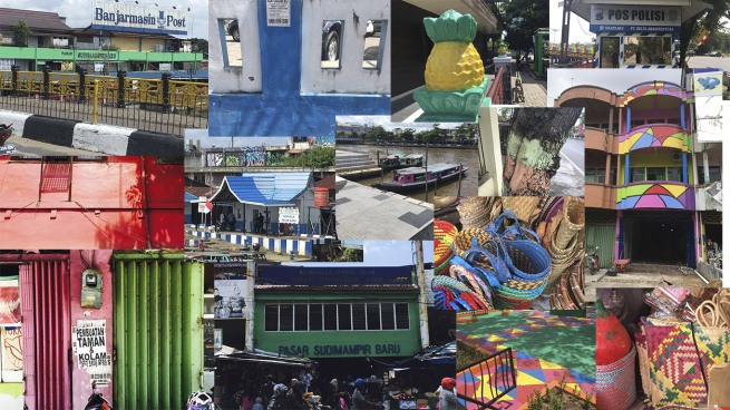
Screen Shot 2018-01-19 at 8.50.23 PM


Initial Mapping

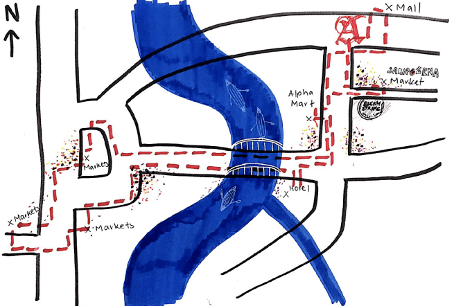
As we recorded our observations we quickly realised we were trying to draw conclusions from what we’d seen; the reasons behind design and behaviour. Despite our efforts, our cultural ignorance and limited language isolated us from a genuine understanding of the things we were seeing. We imagined ourselves as bubbles of another culture floating in the much larger cultural bubble of Banjarmasin. This idea formed the foundation of our map; the misshapen bubble.

But realising our deductions were worth nought, we zoomed out to consider the larger structure of our observations; how did the architecture and the food and the work ethic link? We noticed a lack of urgency in behaviour and a fluidity of environment. The city is inconstant, and the people seem unconcerned. The cultural bubble is fluid. The reasons for this and the goodness or badness of it are beside the point; we don’t have the cultural comprehension to decipher it, we only have the authority to experience it.
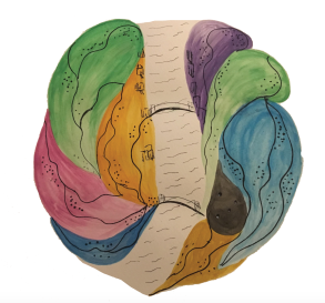
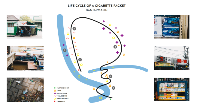
Screen Shot 2018-01-19 at 8.09.20 PM

Design Audit

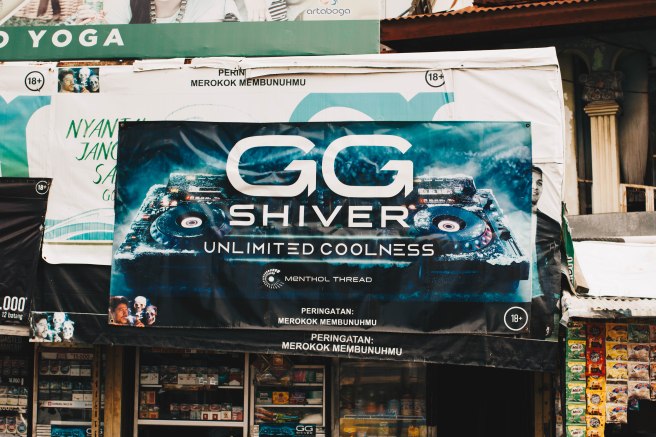
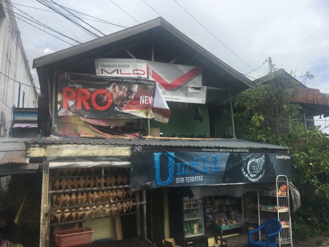
Nonetheless we took quantitative data from our walk, giving us a better sense of the problem. We noticed that the market is predominantly male, with young people smoking more often socially and older men smoking whilst working. This was consolidated in one of our interviews, where the subject shared that smoking is considered masculine; it’s for the ‘gentlemen’. Street vendors and super markets seemed to be primary points of sale, with the most advertising in the city centre dedicated to L.A. Lights. Cigarettes are only purchasable by adults, but it is legal to smoke at any age, with children as young as 4 and 5 engaging in the activity.
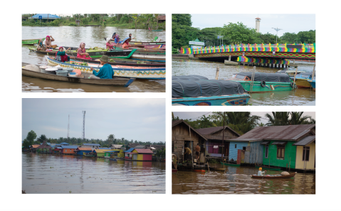
Life in Banjarmasin

In addition to this research, we slowly gained cultural literacy through interaction with locals on the street and in shops and with food and in cars, but this was largely superfluous. More significantly, we learned by the friends we made–we were no longer scrabbling at the top of the culture, accepting what leftovers we could; we were invited to be a part of the city with them. This provided the comprehension necessary to deduce, from the little we knew, enough to develop relevant designs for the stakeholders. And even that is generous to say.Screen Shot 2018-01-19 at 8.09.31 PM

Concept vision

Rather than perpetuating the traditional fear campaign, we wanted to celebrate the vision of a tobacco-free Banjarmasin; a festival isn’t for playing on guilt or anxiety. So our inspiration came from fostering this positivity; healthy lungs for yourself, a safer environment for your family, a good example for your children.

 Screen Shot 2018-01-19 at 8.09.52 PM

Brainstorm

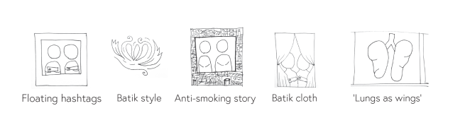
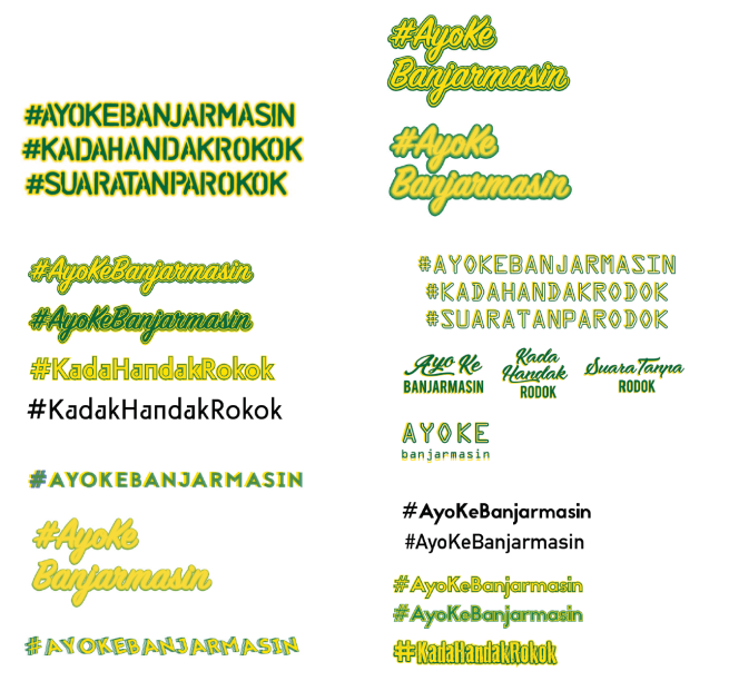
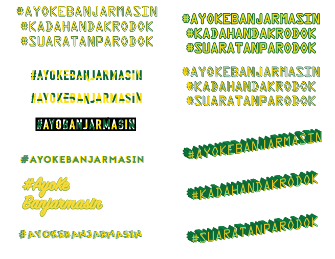
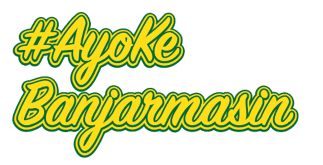
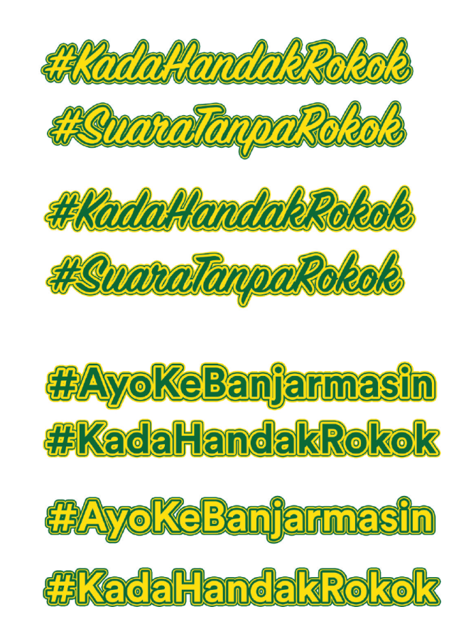
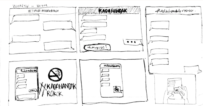
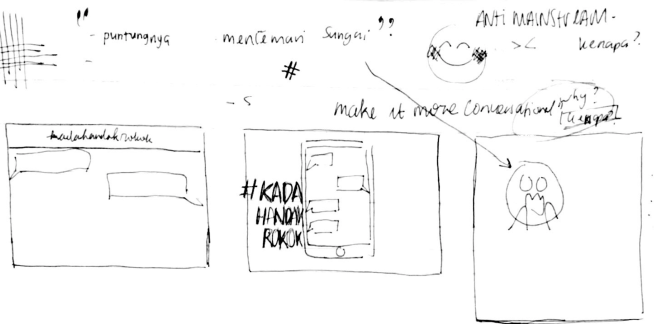
After establishing our vision, we had a mind dump session to brainstorm as many ideas for each pitch as possible. Some of the highlights included floating hashtags, Batik-styled imagery, and anti-smoking narrative, a 3D/layered frame, a cloth frame and lungs ‘as wings’.

Screen Shot 2018-01-19 at 8.10.02 PM 

Concept development

After consultation with Jess and Ali, we settled on a floral mobile frame, and a lung mural to develop as our final designs. We then invested in these to refine and improve them both in line with our vision and according to the advice from the tutors.
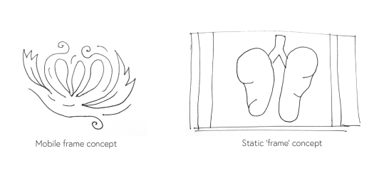
Screen Shot 2018-01-19 at 8.10.07 PM

Screen Shot 2018-01-19 at 8.10.13 PM 

Inspiration

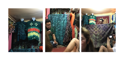
After taking the Sasirangan workshop we were inspired to adapt our concept development to incorporate the style into our illustrations, to offer more recognisable motifs through our final design.

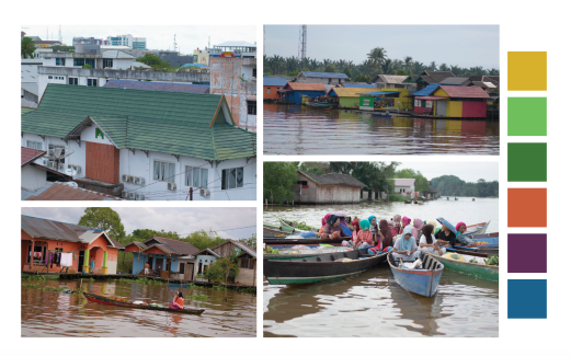
In choosing colour, we collated our photos of the city to create a palette reflective of the city. We colour-swatched from the images and chose a colourful pastel theme, as shown below.

 Screen Shot 2018-01-19 at 8.10.19 PMScreen Shot 2018-01-19 at 8.10.27 PM

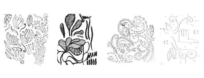
Collaborative drawing

In order to develop the floral theme, the four of us sat down together and drew free form interpretations of floral patterns. We took inspiration from one another as we did so and gathered the most successful elements to adapt as refined illustrations.

 Screen Shot 2018-01-19 at 8.10.33 PM

Refined visual elements

We did this in Illustrator, tidying edges and refining the forms to reflect the desired style, adding colour according to our palette. Our illustrations were designed to ensure relevance to both a mobile and static frame.Screen Shot 2018-01-19 at 8.10.40 PM

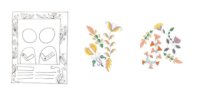
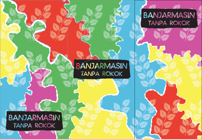
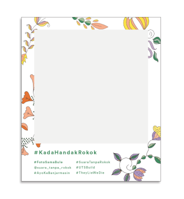
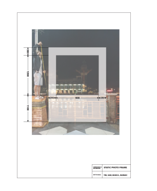
Final Mobile Frame Design

So to lean into the empowerment theme we had established, we used our floral imagery to encourage that positive association with the anti-smoking campaign. We borrowed from local floral and Sasirangan tradition for inspiration in our illustrations, and used pastel colouring to compliment the theme. We balanced the dimensions to maintain ease of use, for holding and carrying, whilst retaining it’s recognition as an Instagram reminiscent frame.

 Screen Shot 2018-01-19 at 8.10.51 PM

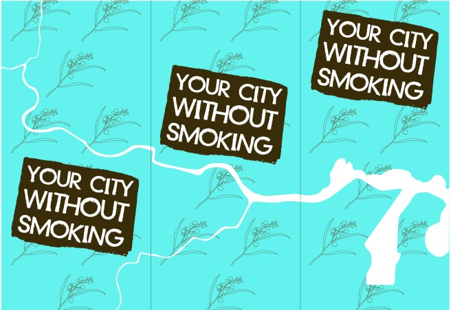
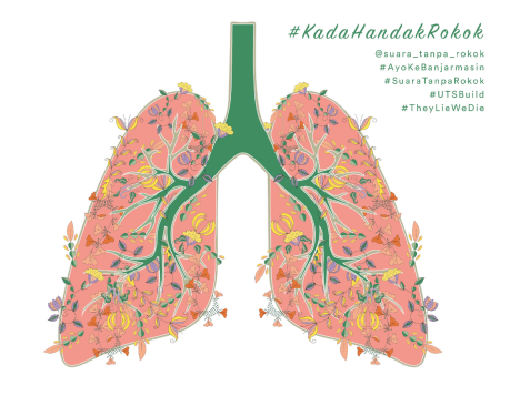
Final Static Frame Design

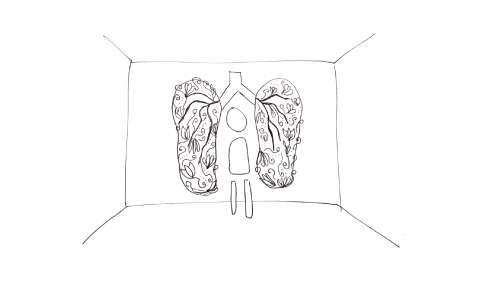
With our vision in mind, we modelled the lungs off wing murals around the world. Festival-goers could pose in between the healthy, life-filled lungs as though they were wings, becoming themselves a part of the art and of the message.

Screen Shot 2018-01-19 at 8.10.58 PM

Hiccups

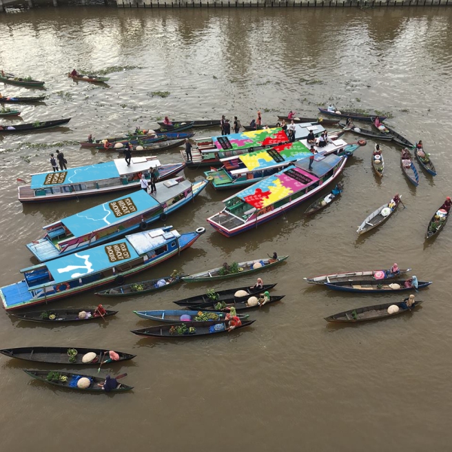
But the process was not smooth! The first mistake we made was in creating a to-scale photoshop(raster) document for the wall, making it a 12m^2 document. The laptop we were using couldn’t handle the size, capping the RAM and preventing us from saving. As a result, we were unable to offer a print version of our design.

On top of this, we took for granted our own role in the production process, and projected onto the VS team our experience of the design industry in Australia. This caused misunderstandings in the executables we needed to undertake, what we needed to follow up and what required further communications. As a result, we had a brief panic after realising we had potentially two large projects to construct and paint ourselves, one more than we’d understood to be in the brief, and only a couple of days to complete them. Fortunately, this stress was alleviated after realising that this was just an extension of our errors in communication.

 Screen Shot 2018-01-19 at 8.11.17 PM

Collaboration

Collaboration was woven throughout the whole process. After receiving our briefs, before beginning to undertake them, we met as a whole group to manage the thematic design of our individual responsibilities in order to ensure cohesion throughout the festival. Before completing our own brief, we assisted the hat group with preparation for and execution of their event. We communicated with them regarding materials and used their leftovers to avoid excess expenditure.

Though as valuable as the in-team collaboration has been, far more significant was the work of VS, in seeing our designs through their production, and working with the media and the local government to make all of it possible.
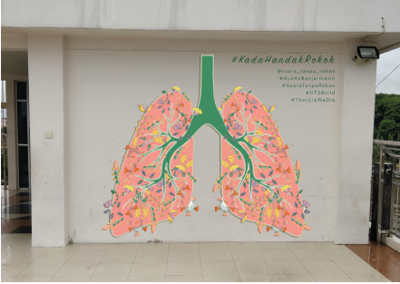
Screen Shot 2018-01-19 at 8.11.08 PM


Passion

Of course, through this whole process we were keen to make what impact we could, but over the last few days that feeling has solidified into something more valuable. Now far from a costless philosophy, a city with which we’ve connected, people whom we care about, a movement to lengthen the lives of people we meet every day here, and many more across the nation. In our interviews we heard about worry for parents to the discomfort felt when a friend lights up. From pride in their own health to the tragedy of 5-year old’s smoking. The problem has become real, and our keenness has become a passion. Despite our ignorance we’re proud to be involved.
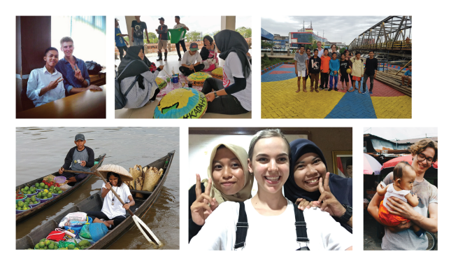
Screen Shot 2018-01-19 at 8.11.24 PM

Group Rambutan – Light Signage Project

To combat the growing tobacco use in Banjarmasin, we worked in partnership with Vital Strategies to create light signage that would ultimately be used to raise awareness within the public and across social media channels via the following hashtags #AyoKeBanjarmasin, #KadaHandakRokok, #SuaraTanpaRokok.

Understanding Banjarmasin and its use of Tobacco

Known as the ‘city of a thousand rivers’, Banjarmasin is the capital of South Kalimantan that has a growing problem of tobacco use amongst youth. To grasp the city’s hustle and bustle and understand how tobacco is used, we conducted primary research by walking the streets of the city and reported our observations through the following map, which presents the ‘life cycle of a cigarette pack’.

Screen Shot 2018-01-19 at 1.33.57 pm.png

Observation Map (Group Rambutan 2018)

This map illustrates, through the use of symbols, where cigarettes are purchased, where and how they are advertised, where they are used and then disposed of. The small kiosks which sold the cigarettes displayed poster advertisements or large tarps which were produced and distributed by the cigarette companies. However, they were not only used for the purpose of advertising with their vibrant commercialised designs, the tarps had adopted a multi-purpose use and were also being used for shade. This was a key observation which we could potentially explore in the future.

IMG_0506

IMG_0492

Tobacco Advertisements in Banjarmasin (7 Jan 2018)

The use of tobacco in Banjarmasin was popular along the river which seemed to be the perfect setting for locals to relax and smoke. The majority of the smokers seemed to be men leading us to question why there was a lack of women smokers. This prompted secondary research which revealed that this was due to mainly religious and cultural purposes but could also be for health reasons (Barraclough 1999).

Following this, it became evident that most of the cigarette packets were being disposed of in or by the river. The irony of this was they were polluting the river, one of Banjarmasin’s most iconic features. Overall, our walk allowed us to immerse ourselves in the contexts of the city we were designing for and ultimately resulted in a greater understanding of how we could create a successful design.

Ideation

Combining our prior research about smoking in Indonesia with our mapping observations, we began to consider how we as designers might respond to the issue of smoking in Banjarmasin both today and in the future. We were initially inspired by IDEO’s Diva Centres project in Zambia to inform young women about contraception and sexual health (IDEO 2017). We wanted to explore how we might be able to create an educational kit for youth in Banjarmasin about the health risks associated with smoking to prevent them from becoming future smokers.

Screen Shot 2018-01-19 at 2.14.33 pm.png

(IDEO.org n.d.)

Subsequently, we began undertaking further research regarding smoking culture in Indonesia, the nature of smoking advertisements as well as how an educational kit might actually be achievable in Banjarmasin. However, we were soon presented with our signage assignment and became aware that an educational kit might be too big an endeavour especially in such a limited time period and with limited resources.

Design Research

After receiving our brief, we begun undertaking visual research both via online resources such as Pinterest to explore both material and conceptual possibilities as well as investigating typography across the streets of Banjarmasin. We were inspired by the wide range of possibilities that we might be able to achieve with the style by utilizing layers of material and combination of colours.

Screen Shot 2018-01-19 at 7.59.11 pm.png

Screen Shot 2018-01-19 at 7.59.02 pm.png

Similarly, we undertook a site visit to the watchtower to take some photos of the space where our signage would be displayed as well as to determine the size of the hashtags for the riverside (which had not been decided yet). Whilst we were able to get a good sense of the space, we were unable to ascend the watchtower on that day and neglected to view it from the other side of the river, which did cause us some issues later down the track as we tried to ensure the legibility of our signage from a distance.

Screen Shot 2018-01-19 at 7.59.07 pm.png

Whilst we enjoyed generating a wide variety of different options for our signage, following a meeting with stakeholders we were made aware of the strict limitations that we had in the materiality and layout of our signage. This meant that we had to reconsider our approach to the design to ensure that we fulfilled all the criteria.

The Design Process

Drawing inspiration from our research, we imagined various outcomes in which the signage could be executed in. Combining methods of hand sketching as well as re-working these with additional techniques on Illustrator and Photoshop, we wanted to test out what concepts were feasible to set up digitally. However, we failed to consider the time frame in which this were to be completed as well as the funding of this project. Once it was realised that the signage were to be hand-cut by the vendor, styles where the text was oblique, had shadowing or separated into multiple lines were ruled out to be economically and practically impossible. We also had to revise the typeface choice for the signage placed on the Menara Pandang to consider the marquee lights, which were to be added in afterwards. Issues relating to the weight of the material used and how it would hold up against the railings, as well as its legibility from a distance were also later recognised.

sketches.jpg

Screen Shot 2018-01-19 at 7.59.16 pm.png

Screen Shot 2018-01-19 at 7.59.23 pm.png

Screen Shot 2018-01-19 at 2.19.48 pm.png

#AyoKeBanjarmasin Design (Group Rambutan 2018)

After re-establishing restrictions and re-working our designs, the style above was noted as our most successful design as it complied to the criteria given. We then experimented with a variety of colour combinations to further test the visibility of letters. Although our initial colour choice was considered as the strongest idea, upon presenting these to the stakeholders it was suggested that the green outline should be black instead, as there was a greater contrast between the yellow and black which allowed the signs to be more visible in the dark. These changes were then made with the exception of the #AyoKeBanjarmasin sign, as it was argued that the city’s colours should be kept with relevance to the city hashtag.

Screen Shot 2018-01-19 at 7.59.28 pm.png

#AyoKeBanjarmasin Design (Group Rambutan 2018)

The decision of a geometric sans-serif font for the signage placed on the Menara Pandang was made to ensure the functionality in accordance with the marquee lights as well as its legibility from a tall height. On the other hand, the hashtags along the river railing were more stylised in order to appeal to the targeted youth of Banjarmasin. Rather than a sans-serif which created separation between the letters, the script font created movement and a sense of flow, alluding to the motion of water and thus, suited the city’s acclaimed title of Banjarmasin as ‘The City Of A Thousand Rivers’.

Screen Shot 2018-01-19 at 7.59.35 pm.png

#AyoKeBanjarmasin Design (Group Rambutan 2018)

Signage in Context

26994823_10216516202636314_355610929_n.jpg

#KadaHandakRokok #AyoKeBanjarmasin at Menara Pendang Banjarmasin (18 January 2018)

watchtowernight.jpg

RiverRailing.jpg

#KadaHandakRokok #AyoKeBanjarmasin at Menara Pendang Banjarmasin (19 January 2018)

Reflection

Overall, designing for Vital Strategies and the city of Banjarmasin was an immense learning experience for Group Rambutan. Through fast-failing and quick iterations, we learnt how to work within a high-pressured environment to meet the demands of a project with a short turnaround time. Having the opportunity to design for a real life client taught us how to liaise with professionals who do not have the design experience to visualise the ideas we were generating. We were able to combat this through placing the designs in its context by creating mock-ups. Our biggest learning curve was understanding how to work within the restrictions provided by the client. As students, we are often given the creative freedom to let our imaginations run wild, however, working in partnership with Vital Strategies gave us a taste of the industry and the intrinsic rewards that come with designing for a great cause. Although our duties as designers have come to a close for this project, we hope that what we have produced will play an integral role in combating the rise of tobacco use in Banjarmasin and beyond.

References

Barraclough, S. 1999, ‘Women and tobacco in Indonesia’, Tobacco Control, vol. 8, no. 3, pp. 327-332.

IDEO.org 2017, Diva Centres, IDEO.org, viewed 8 January 2018, <https://www.ideo.org/project/diva-centres&gt;


Group Durian – Billboard Project ‘The Hidden Voices of Banjarmasin’

Designing the billboard in partnership with Vital Strategies and the community of Banjarmasin was an exercise of iterating and responding to feedback quickly. This went a long way in completing the final design to our satisfaction, professionally and on time. Our brief was to ‘consider local motifs, styles and language’ as well as communicate a ‘global message’. So, we wanted to promote the positivity of not smoking by mirroring Banjarmasin’s lively social media culture but to also give a voice to youths who choose to not smoke, portraying them as the real heroes.

Concept Development:

The design audit was extremely valuable in gathering observations of attitudes around smoking, cigarette consumption and sales. For example, we learned that cigarette advertising is heavily glamourised but is also banned on the main streets of Banjarmasin and can only be found in small residential areas as shown on our map below.

IMG_7102 2
Cigarette advertising is heavily glamourised in Banjarmasin and can only be found in smaller residential areas, not the main streets. (Group Durian. 2018.)
screen-shot-2018-01-19-at-1-50-54-pm1-e1516342893629.png
Map of observations in Banjarmasin from 8th of January 2018. (Group Durian. 2018.)

The concept of a WhatsApp screen was based on our observations of interacting with the Indonesian youth, who are very connected with each other through messaging and Instagram. There was one point where one of our new friends asked for a WhatsApp number, but sadly none of us actually used WhatsApp. Given that the rise of youth smoking was a large focus of Vital Strategies’ work, we chose to communicate through a familiar, relatable format that would project an oppositional stance against peer pressure and the popularity of smoking in Banjarmasin. In the end, this seemed to work well as when we presented the design, Vital Strategies commented that the concept is easily transferrable across different languages and cultures.

The Design Process:

Screen Shot 2018-01-19 at 1.53.09 pm

Screen Shot 2018-01-19 at 1.53.21 pm
Our process started on paper, roughly sketching out how the design would work before we worried about perfecting it on the computer. (Group Durian. 2018.)

A primary research-based approach seemed to serve our group well throughout the whole project as we based the final outcome on interviews with Banjarmasin students and residents, shown in the images below. This constant back-and-forth process of creating mock-ups and receiving feedback from the Banjarmasin youth was very effective in breaking down our assumptions and reinforcing the fact that we were designing for their city. Furthermore, this direct line of communication allowed us to pay close attention to detail so we could refine the wording and learn about cultural differences in Indonesia. For example, we discovered that android is actually more popular over here, so making that change would increase relatability. Similarly, 24 hour time is used more frequently than 12 hour time. This development is shown in our iterations below.

Throughout the design process, we were always confident in our concept early on but the actual design went through many changes as we received feedback from Vital Strategies and accommodated the uncertain billboard dimensions and logos. We had to quickly adapt when Vital Strategies suddenly told us there needed to be multiple logos as we were not sure where to integrate them smoothly. But as a group, this taught us about learning how to successfully adapt to the situation and deliver what the client wants even if we were not sure how it would initially work. Creating a billboard also taught us a lot about designing to a larger scale. As oppose to designing at the actual size like we did initially, we soon discovered that we could design at a smaller scale by using vectors so that it did not pixelate when it was scaled up. Finding vector files was especially difficult for the emojis because they are not our own design.

Reflection:

In the end, this ongoing collaborative process was worthwhile to perfect the outcome and hopefully influence some change among the youth here. This opportunity from Vital Strategies to design a billboard, and contribute on this level in an event of this scale has been exciting, daunting and rewarding. As both designers and global citizens this process has challenged us but as a result we have taken valuable lessons from not only the experience but the people and city of Banjarmasin. It has given us so much more confidence heading into the early stages of our design careers. We would like to say ‘Terima kasih!’ to Vital Strategies for giving us this unique opportunity and we will never forget our first real world clients!

Group Nanas – PROJECT

Our brief was to create 6 banners to be displayed on boats in a 3×3 formation as they drove down the river. They were to be visually striking with a thought-provoking anti-smoking message.

Inspiration and influences

On our initial exploration, we were surprised by the vibrancy of the architecture and public spaces. Locations such as the rainbow bridge, the post office and primary school exhibited striking yellows, blues, greens and pastels. Following the walk, it became paramount that we showcase these colours to portray the city appropriately. Our tour of the floating markets unearthed the ways in which the river underpinned the livelihood of residents. Families washed clothes, bathed, traded and played in the muddy water. This was the first time we truly understood that Banjarmasin was the City of a Thousand Rivers.

Mood Board

The meetings with Vital Strategies, the Mayor and Health Minister attributed the smoking problem to the context of Banjarmasin’s youth and highlighted their pride and commitment to health. The video workshop allowed our group members to build friendships with Banjarmasin high-school and university students, which slowly revealed deep insights into youth attitudes towards smoking and their interactions.

Process

We began our idea generation with an image of a fish across four boats, which progressed from healthy to ill from cigarette consumption. This metaphor played on the idea that cigarettes endanger Banjarmasin’s wildlife as well as its people. Our second idea was to have a photograph of schoolchildren displaying the “tanpa rokok” fist action we had performed at the mayor’s office. We hoped the image of innocent youths would generate sympathy and encourage proactive behaviour. Thirdly, we brainstormed a river inspired by Sasirangan patterns with an anti-smoking message interwoven in the design. This was celebrated as the one with the most potential in our first meeting, so we continued to develop it to be aesthetic and logical.

Feedback and iterations

In the meeting with other groups, we came to the conclusion that we wanted the spirit of the event to be positive and uplifting, so that we could inspire people to join together and make a difference. Vital Strategies emphasised that the banners should be brightly coloured and visible from the riverbank. This provided a slight challenge as when observed from this angle, only a sliver was able to be seen. We also experimented with large type across all of the boats, but didn’t want to result in one boat with the word “smoking” on it which would undermine the impact of the campaign. We settled on the idea of a tiled puzzle pattern which was more visually appealing than verbally affecting, and continued iterating our graphics and typography.

Decision making and outcome

We designed our Banjarmasin banner to meet four key challenges; puzzle, visibility, longevity and effectiveness of the message.

The river, an important and recognisable symbol of the city, is used to divide the chunks of colour and construct the puzzle to flow from one klotok to another.

While the detail of the banners will elude spectators on the riverbank, the vibrant colours chosen will hopefully catch their attention and encourage investigation, photography and social media activity.

Banjarmasin Tanpa Rokok is stamped boldly onto each boat, which allows them to travel separately in the future without one reading “Rokok”. The stamp design alludes to the commitment that the government and people have put into reducing the smoking rate in the city.

Screen Shot 2018-01-19 at 12.48.09Print

We designed a watermark, using the plant on Banjarmasin’s city crest to add another intriguing layer to our banner for people sitting atop the klotok. If the banners remain on the klotok after the festival, the anti-smoking message will continue to resonate through Banjarmasin.

The Sydney banner is designed to incorporate the same design elements as Banjarmasin’s banner. The watermark was an elegant wattle flower, and the river was simplified and took the shape of Sydney’s Parramatta River. The blue reflects Sydney’s oceans and rivers, with a message to inspire other cities to follow Banjarmasin’s lead.

Reflection

While the iterative process was lengthy with multiple iterations and rounds of feedback, it allowed us to establish a clearer idea of the brief. An important point of feedback was that we should have communicated with Vital Strategies in a way they allowed them to understand our design elements and share our vision for the banner. Given our vague brief, we made a recipe when we had been given a soup. We were grateful that we could take part in this enriching design process and produce something that is visually appealing, purposeful and enduring.

Banners final mockup