

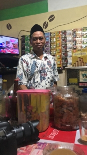
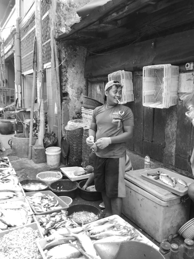
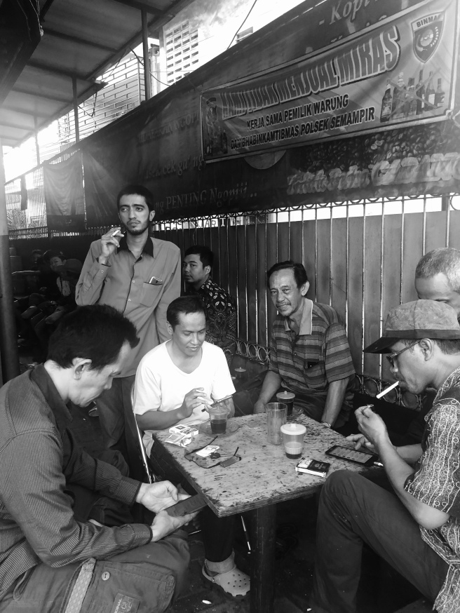
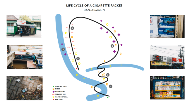
Indonesia is one of the biggest consumers of tobacco in the world with 70% of their population being smokers (WHO, 2018). Aggressive marketing tactics and misinformation contribute to a misinformed understanding of the health risks associated with smoking. This is in conjunction with an endearing view of tobacco in the hearts and minds of the Indonesian people. In a distinctly difficult problem space, we worked to create a campaign focused upon recontextualising and subverting the aspirational perception of tobacco and highlighting the benefits of a smoke-free lifestyle in both the long and short term.


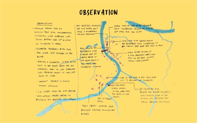
From our research, we distilled a series of key insights that influenced our ideation process. We categorised our insights into 3 pillars of a STEEP analysis: socio-cultural, economic and political – as we found these to be the most dominant influencers of tobacco culture within Indonesia. We deduced that the most effective way to implement any real change would be to have a bottom-up approach. Through our ethnographic observations, and empirical insights it was evident that community enforced codes of conduct were received with more compliance than government legislation.
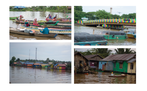
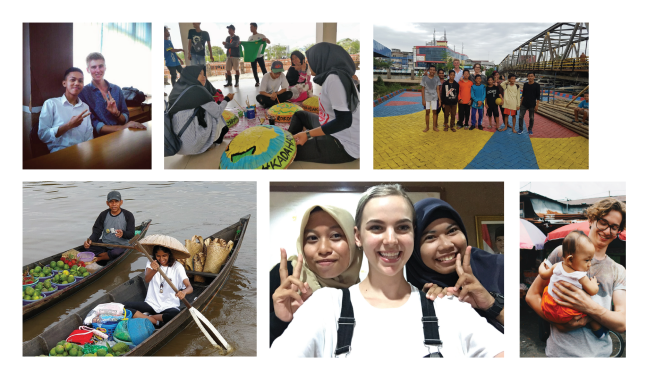
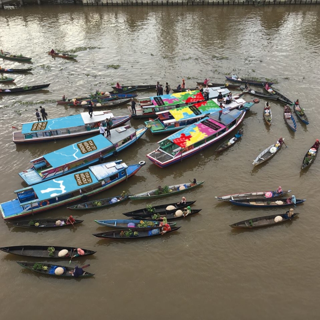
By drawing upon multiple streams of information we hoped to quickly gain a comprehensive understanding of the statistics associated with tobacco usage and its complex intrinsicness within Indonesian culture. In tandem with the information ascertained, we conducted interviews with a number of stakeholders to better understand the local perception of Indonesia’s tobacco industry, as well as their understanding of smoking-related disease.
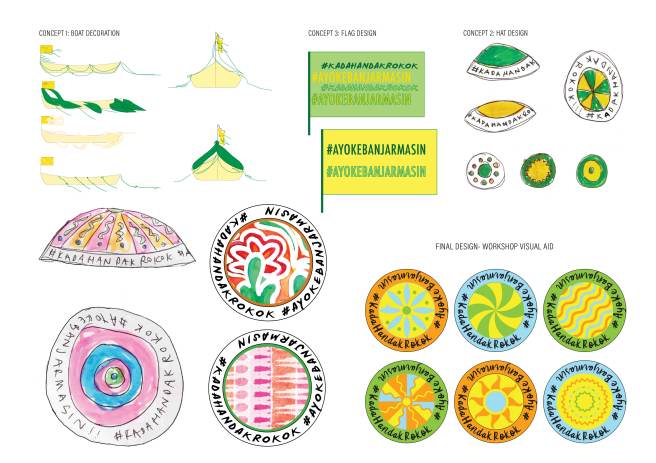
Following the collation of our research, we began the process of quickly interpreting these insights into various viable strategies in order to assess both a direction and intention for the rest of our design campaign. Following the research phase, we formulated a consensus on our target group being young Indonesians aged between 15 – 25.
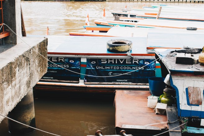
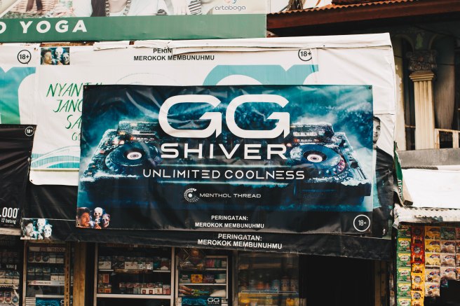
Studies have found that a non-smoker identity was a major influence on intention to quit and was positively correlated with higher success rates of quitting (Meijer et al., 2015). In Indonesia, tobacco marketing has spent years building a powerful aspirational narrative around smoking, one that frames the protagonist (the smoker) as more successful, more attractive, more confident and more masculine. It follows that the antithesis of these qualities; unsuccessful, unattractive, meek, weak, etc., start to become associated with the passive act of refraining. For adolescent Indonesians that are highly affected by social and peer pressures, this highlights the importance of addressing and fostering social identities for non-smokers.
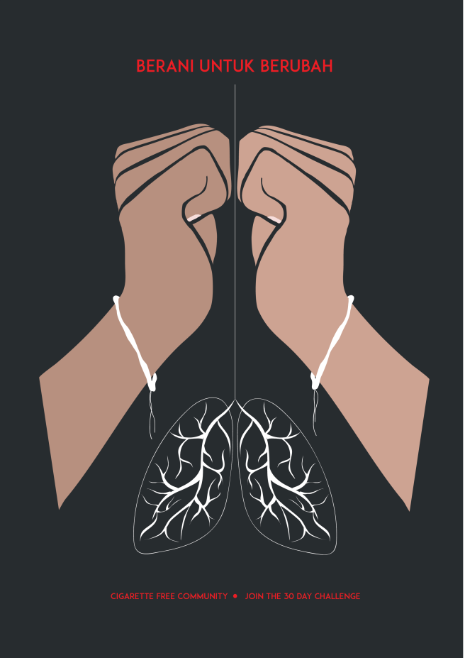
Our design solution is a campaign that outlines how to initiate these ideas to create a brand and hopefully a movement.
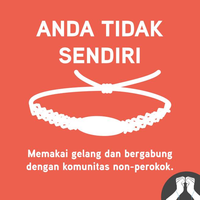
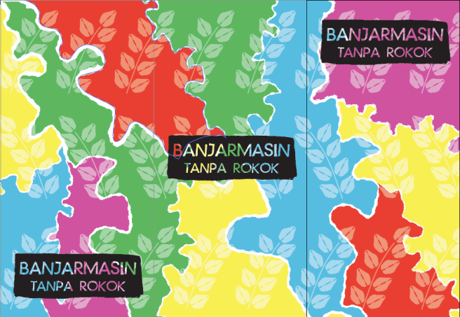
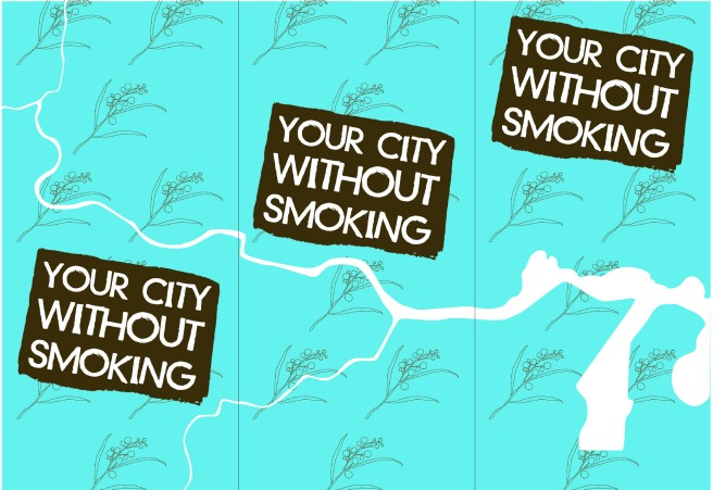
Pilihan Kita (our choice) is a campaign which draws on the aspirational marketing misused in Indonesia, creating a social identity for people looking to quit smoking. Stemming from second and first-hand accounts, we have created a multi-channel campaign that facilitates a safe and positive community for like-minded individuals.
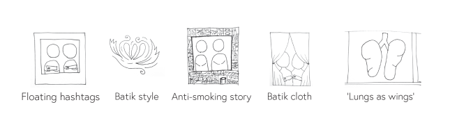
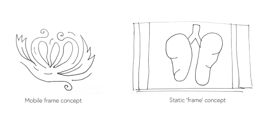
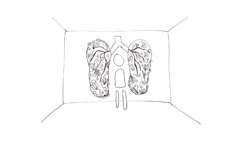
This notion of personal aspiration was continued within the creation of small comic strips. These comic strips effectively depict contextually significant aspirational stories with the aim being to change the perception of smoking as a roadblock on the path to achieve personal goals. The aspirations we chose to depict focused on the social and economic consequences of habitual smoking (which largely remain unnoticed by the Indonesians, courtesy of big tobacco). By focusing on these consequences we hope to open a new conversation about the effects of smoking in the present rather than long-term health impacts due to the relevance of these issues for young Surabaya’s.


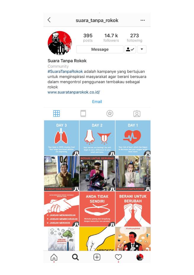
The Instagram page is designed to facilitate a community and accountability which is proven to increase the success rate of quitting smoking. It allows people to share their stories, their motivations and location enabling them to feel like they are part of a community that is making the choice to live healthier, richer and tobacco-free.
=
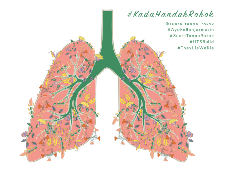
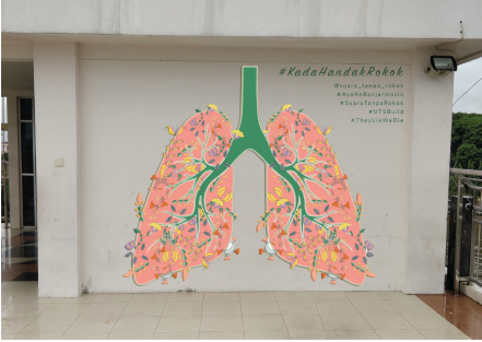
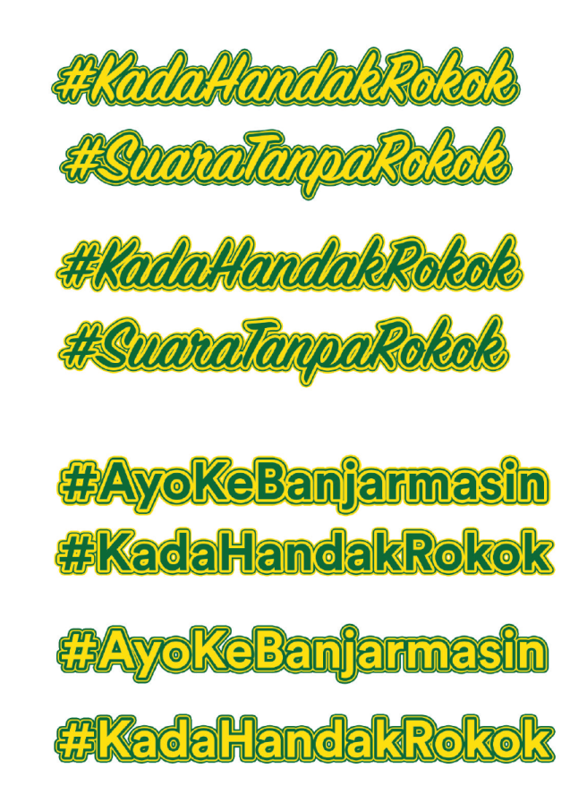
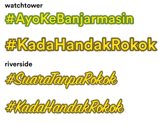
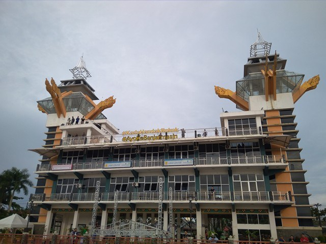
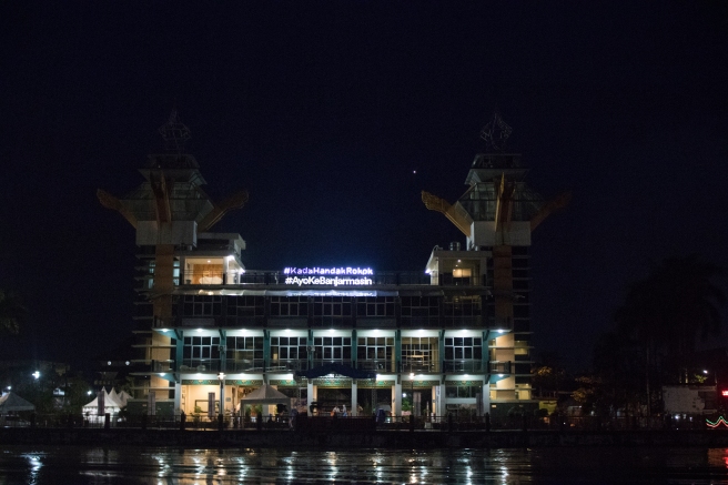
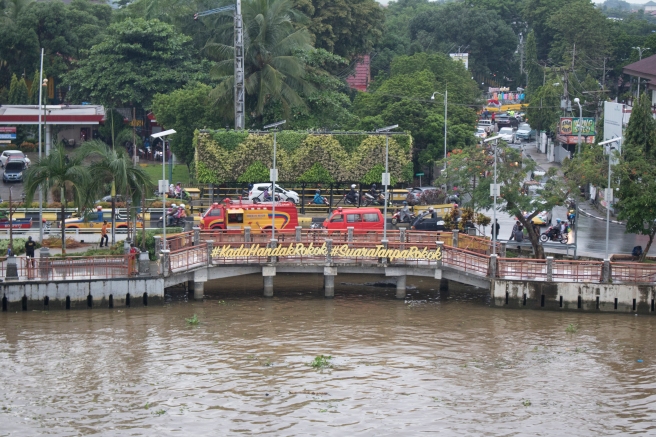
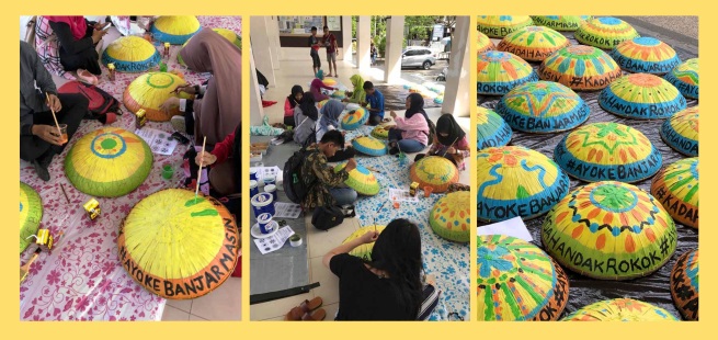
People who are interested in our movement can contact us via the landing page and ask for stickers and signage free of charge. This is a way for them to actually help us by making their tangible mark on public space. This will aid in ensuring the sustainability of the movement. Once we have amplified and instilled the message, it’s important to make sure that it remains present in the everyday lives of Surabaya’s, even just in a small way. Walking through the streets of Surabaya you are bombarded with imagery from Big Tobacco. We can claim back some space ourselves in our own small way. Signage can assist neighbourhoods and businesses in their efforts to keep public spaces smoke free, but this collateral also fosters solidarity and recognition amongst strangers. It fosters the notion that each one of us is not alone, and we have strength in numbers, that together we have the power to influence real and permanent social change.
Tobacco companies are not selling a product; they are selling the dream of a better future which is something much more powerful and mobilising. Our campaign recognises this. The way that we have chosen to respond is through the construction of another narrative. The difference is that this one is real, it’s based on facts and science, and it can have a positive impact on Surabayan society today.
In summary, the campaign is drawing on the success of aspirational marketing narratives that are commonly misused in tobacco advertising. Our multi-platform campaign will work to foster a new social identity, a community and as a result, an effective support system. With the implementation of this campaign, Surabaya could see the growth of a community that sees through the lies of the tobacco advertising and strives to support each other, working together to lead better lives.
REFERENCE LIST
Meijer, E., Gebhardt, W., Dijkstra, A., Willemsen, M. & Van Laar, C., 2015, ‘Quitting smoking: The importance of non-smoker identity in predicting smoking behaviour and responses to a smoking ban’, Psychology & Health, vol 30, no 12, pp.1387-1409.
World Health Organization 2018, Tobacco Control in Indonesia, viewed 8 December 2018, <http://www.who.int/tobacco/about/partners/bloomberg/idn/en/>.
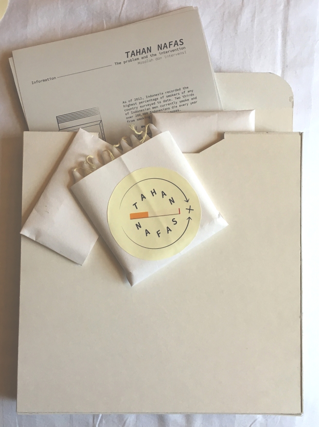

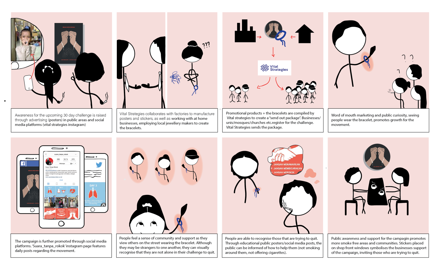
 To start creating community notions from the get go, this campaign is actually targeted at groups of people. The idea being that groups such as educational institutions, workplaces or entire geographical communities could sign up for a ‘package’, which would contain all the necessary merchandise, advertising and messages. Local businesses and vendors would also be given an opportunity to sign up from a different angle and contribute products that meet a criteria as well creating small business opportunities. All products are collated through vital strategies and then distributed to the communities and groups. Which then markets itself through social media and word of mouth.
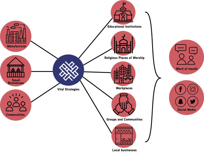


")
")


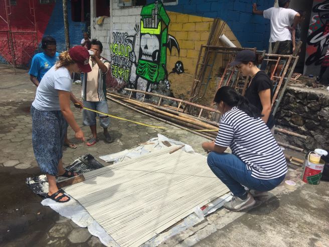 Creating stencils out of masking tape for each of the sun shades.


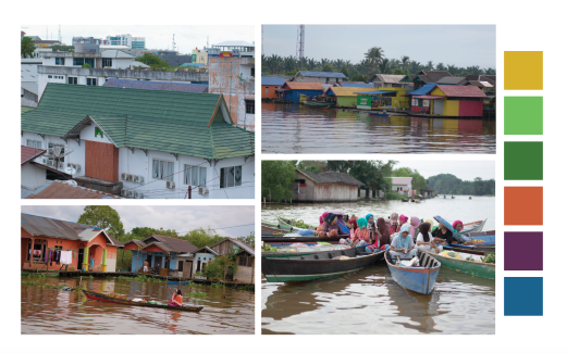
 Washing brushes and rollers after painting our sunshades in Kali Code with Nanda (middle) and friend.


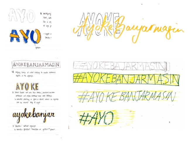
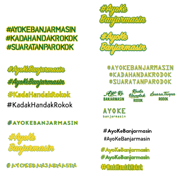
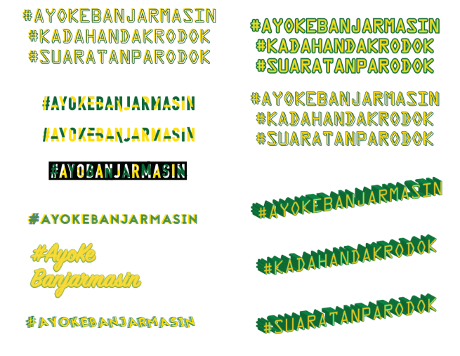
 Su, A. 2017, Draft Sketches
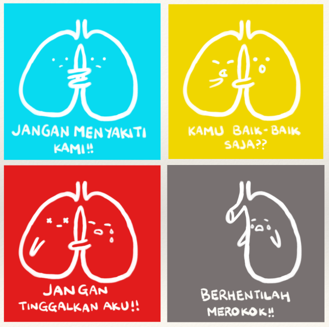 Su, A. 2017, First initial Comic Strip Illustrations
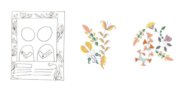
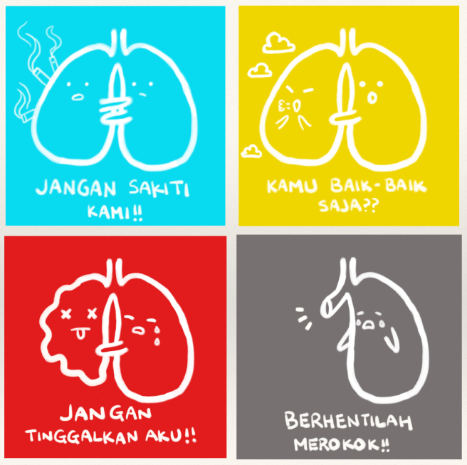 Su, A. 2017, Final Comic Strip Illustrations
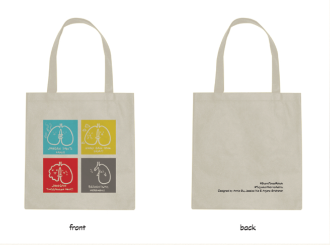
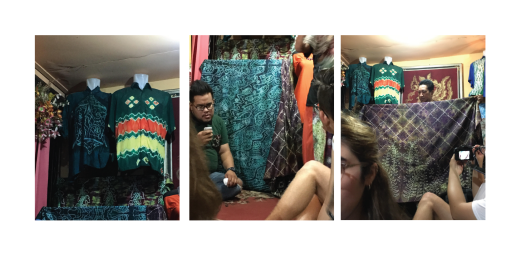
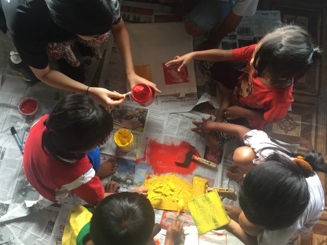 Su, A. 2017, Wood Block Printing Workshop with the children.
 Su, A. 2017, Wood Block Printing Workshop with the children.
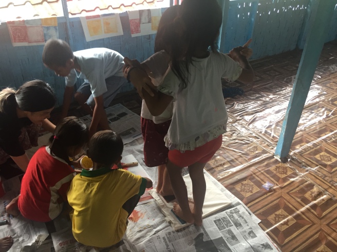 Su, A. 2017, Wood Block Printing Workshop with the children.
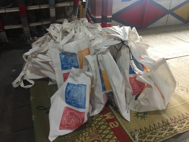 Su, A. 2017, Completed Tote Bags
